Branding
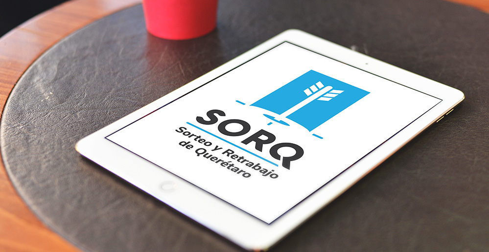
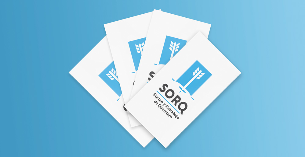
SORQ
© All Rights Reserved
Is a company focused on the raffle and review of the pieces, giving certainty to its customers that all the pieces are well made and are the equal. The arrow and the target is used as a reference to certainty and precision, which is always embedded right in the target. The combination of colors refers to tranquility and confidence as added value.