Branding
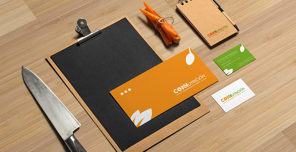
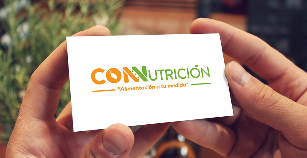
CONNUTRICIÓN
© All Rights Reserved
Is a company focused on the balanced nutrition based on scientific knowledge and natural methods, always giving the support required to their patients, providing a integral consultation to each of them. The spoon is implemented in the graphic image as a symbol of good nutrition, the three points refer to the consultans, food orientation and the program of hygiene and food for companies, the accent mark in the form of a leaf symbolizes the natural and healthy. The chosen colors refer to help, security, peace, health and well-being.